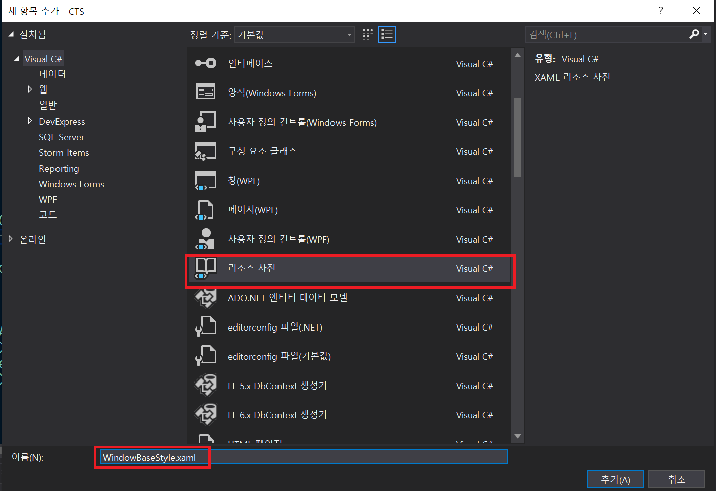
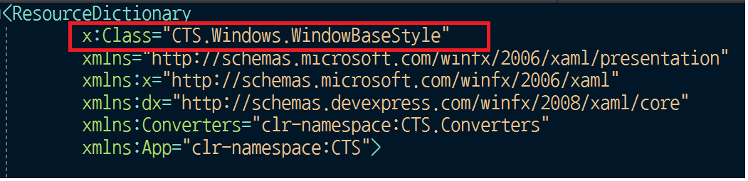
내용 보기

작성자

관리자 (IP : 172.17.0.1)

날짜

2020-08-09 06:08

제목

[WPF] Window Base 구성하기 with DevExpress 테마 적용


WPF프로젝트 개발에서 커스텀 하게 윈도우 크롬을 제거하고
윈도우 타이틀바, 컨트롤박스를 구현하는 과정에서 같은 스타일의 윈도우를 팝업 윈도우 형식으로 여러개 사용해야 하는 상황
이 생겨 귀찮게 매번 각 윈도우를 꾸미지 않고 기본 스타일을 Base로 만들어서 사용할 수 있도록 구현해봤다.

동시에 기본 스타일을 사용하면서 DevExpress의 테마도 같이 사용해야 하는 환경에서 구현하게 되었다.

  • 윈도우 기본 스타일 구성 및 적용하기.

우선은 Window 모습의 기본이 되는 스타일을 먼저 생성해 준다.

리소스 사전을 추가해서 윈도우 기본 스타일을 만들어준다.

WindowBaseStyle.xaml
<ResourceDictionary
        x:Class="CTS.Windows.WindowBaseStyle"
        xmlns="http://schemas.microsoft.com/winfx/2006/xaml/presentation"
        xmlns:x="http://schemas.microsoft.com/winfx/2006/xaml"
        xmlns:dx="http://schemas.devexpress.com/winfx/2008/xaml/core"
        xmlns:Converters="clr-namespace:CTS.Converters"
        xmlns:App="clr-namespace:CTS">
    
    <Converters:EnumToBooleanConverter x:Key="EnumToBooleanConverter" />
 
    <Style x:Key="sButton_Minimize" TargetType="{x:Type Button}">
        <Setter Property="FocusVisualStyle" Value="{StaticResource ButtonFocusVisual}"/>
        <Setter Property="Background" Value="{StaticResource ButtonNormalBackground}"/>
        <Setter Property="BorderBrush" Value="{StaticResource ButtonNormalBorder}"/>
        <Setter Property="BorderThickness" Value="1"/>
        <Setter Property="Foreground" Value="{DynamicResource {x:Static SystemColors.ControlTextBrushKey}}"/>
        <Setter Property="HorizontalContentAlignment" Value="Center"/>
        <Setter Property="VerticalContentAlignment" Value="Center"/>
        <Setter Property="Padding" Value="1"/>
        <Setter Property="Template">
            <Setter.Value>
                <ControlTemplate TargetType="{x:Type Button}">
                    <Grid Background="#00000000">
                        <Border x:Name="icon_shadow" BorderBrush="{x:Null}" BorderThickness="0" Margin="0,6,0,0" Background="Black" Width="12" Height="3" SnapsToDevicePixels="True"/>
                        <Border x:Name="icon" BorderBrush="{x:Null}" BorderThickness="0" Margin="0,9,0,0" Background="White" Width="12" Height="3" SnapsToDevicePixels="True"/>
                    </Grid>
                    <ControlTemplate.Triggers>
                        <Trigger Property="IsPressed" Value="True">
                            <Setter Property="Background" TargetName="icon" Value="#FFFF7800"/>
                        </Trigger>
                        <Trigger Property="IsEnabled" Value="false">
                            <Setter Property="Foreground" Value="#ADADAD"/>
                            <Setter Property="Background" TargetName="icon" Value="#FF606060"/>
                        </Trigger>
                    </ControlTemplate.Triggers>
                </ControlTemplate>
            </Setter.Value>
        </Setter>
    </Style>
 
    <Style x:Key="sToggleButton_Restore" TargetType="{x:Type ToggleButton}">
        <Setter Property="FocusVisualStyle" Value="{StaticResource ButtonFocusVisual}"/>
        <Setter Property="Background" Value="{StaticResource ButtonNormalBackground}"/>
        <Setter Property="BorderBrush" Value="{StaticResource ButtonNormalBorder}"/>
        <Setter Property="BorderThickness" Value="1"/>
        <Setter Property="Foreground" Value="{DynamicResource {x:Static SystemColors.ControlTextBrushKey}}"/>
        <Setter Property="HorizontalContentAlignment" Value="Center"/>
        <Setter Property="VerticalContentAlignment" Value="Center"/>
        <Setter Property="Padding" Value="1"/>
        <Setter Property="Template">
            <Setter.Value>
                <ControlTemplate TargetType="{x:Type ToggleButton}">
                    <Grid Background="#00000000">
                        <Grid x:Name="grid" Margin="0" Visibility="Visible">
                            <Path x:Name="icon_shadow" Data="M1,4.8371952 L1,8.2980001 6,8.2980001 6,4.8371952 z M0,3.5977873 L7,3.5977873 7,9.2980001 0,9.2980001 z M1.9220893,1.3822247 L8.922089,1.3822247 8.922089,7.3594513 7.8387051,7.3594513 7.7970131,2.56259 1.9220893,2.5313401 z" Fill="Black" HorizontalAlignment="Stretch" Height="12" Margin="0,0,1,1" StrokeStartLineCap="Round" Stretch="Fill" StrokeEndLineCap="Round" Stroke="{x:Null}" StrokeThickness="0" VerticalAlignment="Stretch" Width="13" SnapsToDevicePixels="True"/>
                            <Path x:Name="icon" Data="M1,4.8371952 L1,8.2980001 6,8.2980001 6,4.8371952 z M0,3.5977873 L7,3.5977873 7,9.2980001 0,9.2980001 z M1.9220893,1.3822247 L8.922089,1.3822247 8.922089,7.3594513 7.8387051,7.3594513 7.7970131,2.56259 1.9220893,2.5313401 z" Fill="White" HorizontalAlignment="Stretch" Height="12" Margin="0,1.5,1,0" StrokeStartLineCap="Round" Stretch="Fill" StrokeEndLineCap="Round" Stroke="{x:Null}" StrokeThickness="0" VerticalAlignment="Stretch" Width="13" SnapsToDevicePixels="True"/>
                        </Grid>
                        <Grid x:Name="isChecked" Margin="0" Visibility="Collapsed">
                            <Border x:Name="icon_shadow1" BorderBrush="Black" BorderThickness="2,3,2,2" Margin="0,0,0,1" Width="12" Height="10" SnapsToDevicePixels="True"/>
                            <Border x:Name="icon1" BorderBrush="White" BorderThickness="2,3,2,2" Margin="0,2,0,0" Width="12" Height="10" SnapsToDevicePixels="True"/>
                        </Grid>
                    </Grid>
                    <ControlTemplate.Triggers>
                        <Trigger Property="IsChecked" Value="True">
                            <Setter Property="Visibility" TargetName="isChecked" Value="Visible"/>
                            <Setter Property="Visibility" TargetName="grid" Value="Collapsed"/>
                        </Trigger>
                        <Trigger Property="IsPressed" Value="True">
                            <Setter Property="Fill" TargetName="icon" Value="#FFFF7800"/>
                        </Trigger>
                        <MultiTrigger>
                            <MultiTrigger.Conditions>
                                <Condition Property="IsChecked" Value="True"/>
                                <Condition Property="IsPressed" Value="True"/>
                            </MultiTrigger.Conditions>
                            <Setter Property="BorderBrush" TargetName="icon1" Value="#FFFF7800"/>
                        </MultiTrigger>
                        <Trigger Property="IsEnabled" Value="false">
                            <Setter Property="Foreground" Value="#ADADAD"/>
                            <Setter Property="Fill" TargetName="icon" Value="#FF606060"/>
                        </Trigger>
                    </ControlTemplate.Triggers>
                </ControlTemplate>
            </Setter.Value>
        </Setter>
    </Style>
 
    <Style x:Key="sButton_Close" BasedOn="{x:Null}" TargetType="{x:Type Button}">
        <Setter Property="Template">
            <Setter.Value>
                <ControlTemplate TargetType="{x:Type Button}">
                    <Grid Background="#02000000" Width="Auto" Height="Auto" HorizontalAlignment="Stretch" VerticalAlignment="Stretch">
                        <Path Fill="{x:Null}" Stretch="Fill" Stroke="Black" StrokeEndLineCap="Square" StrokeStartLineCap="Square" StrokeThickness="1.5" Data="M0.75,0.75 L7.25,7.25 M7.25,0.75 L0.75,7.25" x:Name="path_shadow" Margin="0,0,0,2" Width="10" Height="10" HorizontalAlignment="Stretch" VerticalAlignment="Stretch" SnapsToDevicePixels="True" />
                        <Path Fill="{x:Null}" Stretch="Fill" StrokeEndLineCap="Square" StrokeStartLineCap="Square" StrokeThickness="1.5" Data="M0.75,0.75 L7.25,7.25 M7.25,0.75 L0.75,7.25" x:Name="path" Width="10" Height="10" VerticalAlignment="Stretch" SnapsToDevicePixels="True" Stroke="#FFBBBBBB" />
                    </Grid>
                    <ControlTemplate.Triggers>
                        <Trigger Property="IsMouseOver" Value="True">
                            <Setter Property="Stroke" TargetName="path" Value="#FFFFFFFF"/>
                        </Trigger>
                        <Trigger Property="IsPressed" Value="True">
                            <Setter Property="Stroke" TargetName="path" Value="#FFFF7800"/>
                        </Trigger>
                    </ControlTemplate.Triggers>
                </ControlTemplate>
            </Setter.Value>
        </Setter>
        <Setter Property="SnapsToDevicePixels" Value="True"/>
    </Style>
 
    <Style x:Key="WindowBase" TargetType="{x:Type dx:ThemedWindow}">
        <Setter Property="Template">
            <Setter.Value>
                <ControlTemplate TargetType="{x:Type dx:ThemedWindow}">
                    <Grid>
                        <Grid.RowDefinitions>
                            <RowDefinition Height="30"/>
                            <RowDefinition Height="*"/>
                        </Grid.RowDefinitions>
 
                        <!--상단 타이틀바-->
                        <Grid x:Name="xTitleGrid"
                              Grid.Row="0">
                            <Border BorderThickness="0" CornerRadius="10,10,0,0" >
                                <Border.Background>
                                    <LinearGradientBrush EndPoint="0.5,1" StartPoint="0.5,0">
                                        <GradientStop Color="#FF4E4E4E" Offset="0"/>
                                        <GradientStop Color="#FF2B2B2B" Offset="0.7"/>
                                    </LinearGradientBrush>
                                </Border.Background>
                            </Border>
                            <TextBlock Text="{x:Static App:App.ProductTitle}" 
                                       HorizontalAlignment="Center"
                                       Margin="0,0,0,2"
                                       VerticalAlignment="Center"
                                       Foreground="Black"
                                       FontWeight="Bold"
                                       Style="{DynamicResource xNanumSquareFont}"/>
                            <TextBlock Text="{x:Static App:App.ProductTitle}"
                                       HorizontalAlignment="Center"
                                       Margin="0"
                                       VerticalAlignment="Center"
                                       Foreground="#FF969696"
                                       FontWeight="Bold"
                                       Style="{DynamicResource xNanumSquareFont}"/>
                            <StackPanel HorizontalAlignment="Right"
                                        Orientation="Horizontal"
                                        VerticalAlignment="Center"
                                        Margin="0, 0, 10, 0">
                                <Button x:Name="xMinimizeToggleButton"
                                        IsTabStop="False"
                                        Width="20"
                                        Height="18"
                                        HorizontalAlignment="Center"
                                        VerticalAlignment="Center"
                                        Margin="0, 0, 5, 0"
                                        Style="{DynamicResource sButton_Minimize}"/>
                                <ToggleButton x:Name="xMaximizeToggleButton"
                                              IsTabStop="False"
                                              Width="20"
                                              Height="18"
                                              HorizontalAlignment="Center"
                                              VerticalAlignment="Center"
                                              IsChecked="{Binding RelativeSource={RelativeSource FindAncestor, AncestorType={x:Type Window}}, Path=WindowState, Converter={StaticResource EnumToBooleanConverter}, ConverterParameter=Normal}"
                                              Margin="0,0,5,0"
                                              Style="{DynamicResource sToggleButton_Restore}"/>
                                <Button x:Name="xCloseButton"
                                        IsTabStop="False"
                                        Width="20"
                                        Height="18"
                                        HorizontalAlignment="Center"
                                        VerticalAlignment="Center"
                                        Style="{DynamicResource sButton_Close}"/>
                            </StackPanel>
                        </Grid>
                        <!--상단 타이틀바 END-->
 
                        <AdornerDecorator Grid.Row="1">
                            <ContentPresenter ContentTemplate="{TemplateBinding ContentTemplate}" 
                                              Content="{TemplateBinding Content}"
                                              ContentStringFormat="{TemplateBinding ContentStringFormat}"/>
                        </AdornerDecorator>
                    </Grid>
                </ControlTemplate>
            </Setter.Value>
        </Setter>
    </Style>
</ResourceDictionary>
 
cs

대략적으로 심플하게 위 처럼 윈도우의 기본이 되는 스타일을 꾸몄다.
크롬을 없애고, 타이틀바와 컨트롤박스를 커스텀하게 꾸민 것이다.

실제 각 윈도우에서 사용되는 스타일은
<Style x:Key="WindowBase" TargetType="{x:Type dx:ThemedWindow}"> 영역의
WindowBase 스타일 이다.
TargetType이 dx:ThemedWindow인 것은 DevExpress의 테마 윈도우를 기본으로 사용하기 위해 타입을 저렇게 설정했다.


중간쯤 보면 ContentPresenter로 윈도우의 컨텐츠가 표시될 영역 위치를 설정한것을 볼 수 있다.

ContentPresenter를 AdornerDecorator로 감싼 이유는 AdornerDecorator자체가 화면에 요소를 렌더링할때 추가적으로 기능을 제공해 주는 역할을 하는데 여기서는 AdornerDecorator의 자식 컨트롤은 항상 최상위로 표시 되기에 한번 감싸준 것이다. 사실상 AdornerDecorator는 없어도 아무 문제는 없다.

자, 이제 윈도우의 기본 스타일을 만들었으니 위 스타일을 적용하기 위해
App의 Style에 포함시켜 보자

App.xaml

<Application.Resources>
    <ResourceDictionary>
        <ResourceDictionary.MergedDictionaries>
            <ResourceDictionary Source="/CTS;component/Windows/WindowBaseStyle.xaml"/>
        </ResourceDictionary.MergedDictionaries>
...
cs

위 처럼 App.xaml에서 App Style에 ResourceDictionary를 머지 시켜준다.
위 처럼 머지 후 Static하게 해당 스타일에 접근이 가능하다. (StaticResource)

여기까지 되었다면 윈도우의 기본 스타일 사용 구성이 모두 끝난것이다.
이제 윈도우를 생성 할때마다 해당 스타일을 적용만 해주면 된다.

DevExpress의 dx:ThemedWindow 윈도우를 생성하고
WindowBaseStyle 스타일을 적용해 보자.

깔끔하게 기본 스타일이 반영되고 해당 윈도우의 컨텐츠까지 모두 반영된것이 디자이너상으로 바로 표시된다.

※ 참고
윈도우 기본 스타일을 적용하고 컨트롤박스의 각 버튼이 실제 동작되려면
윈도우 기본 스타일이 적용된 해당 윈도우에도 크롬이 제거 되어야 정상 마우스 이벤트가 발생된다.

위 상태에서 DevExpress의 테마적용도 정상 적용되서 표시된다.

dx:ThemeManager.ThemeName="Office2019DarkGray"
cs


  • WindowBaseStyle 코드비하인드 class 구성.

WindowBaseStyle의 ResourceDictionary에 포함되어 있는 각 여러 컨트롤의 이벤트를 직접 코드비하인드 상에서 처리할 수 있다.
단순히 다음과 같이 ResourceDictionary에 class만 연결시켜 주면 된다.

그리고 해당 클래스는 다음과 같이 추가할 수 있다.

WindowBaseStyle.cs
/// <summary>
/// WindowBaseStyle.xaml(ResourceDictionary) 의 비하인드 코드 Class
/// </summary>
public partial class WindowBaseStyle : ResourceDictionary
{
    public WindowBaseStyle()
    {
            
    }
}
cs


  • WindowBase class 만들기.

WindowBaseStyle에는 커스텀화된 타이틀바, 컨트롤박스가 구성되어 있는데 공통적인 기능 구현을
각각 윈도우에서 처리하게 되면 중복코드가 발생되고 추후 유지보수 또한 좋지 못하다.
그래서 공통적인 기능을 처리 할 수 있는 WindowBase class를 만들고 해당 클래스를 상속받도록 처리하였다.

먼저 윈도우의 공통 처리부를 담당하는 WindowBase class를 추가한다.

WindowBase.cs

using DevExpress.Xpf.Core;
using System;
using System.Collections.Generic;
using System.Linq;
using System.Text;
using System.Threading.Tasks;
using System.Windows;
using System.Windows.Controls;
using System.Windows.Controls.Primitives;
using System.Windows.Data;
using System.Windows.Documents;
using System.Windows.Input;
using System.Windows.Media;
using System.Windows.Media.Imaging;
using System.Windows.Shapes;
 
/// <summary>
/// BaseWindow.xaml에 대한 상호 작용 논리
/// </summary>
public class WindowBase : ThemedWindow
{
    /// <summary>
    /// 기존 창 크기
    /// </summary>
    private Rect _originWindow;
 
    public WindowBase()
    {
        this.Loaded += this.WindowBase_Loaded;
        this.Closing += this.WindowBase_Closing;
    }
 
    public override void OnApplyTemplate()
    {
        base.OnApplyTemplate();
 
        this.ControlBoxEventSubscribe();
        this.WindowBaseMoveEventSubscribe();
    }
 
    private void WindowBase_Closing(object sender, System.ComponentModel.CancelEventArgs e)
    {
        this.SaveLayout();
    }
 
    private void WindowBase_Loaded(object sender, RoutedEventArgs e)
    {
        this.LoadLayout();
    }
 
    protected virtual void LoadLayout()
    {
    }
 
    protected virtual void SaveLayout()
    {
    }
 
    /// <summary>
    /// WindowBase Style ControlBox Event Handler
    /// </summary>
    private void ControlBoxEventSubscribe()
    {
        ToggleButton maximizeBtn = GetTemplateChild("xMaximizeToggleButton"as ToggleButton;
        if (maximizeBtn != null)
        {
            maximizeBtn.Click += new RoutedEventHandler(delegate (Object s, RoutedEventArgs e)
            {
                this.WindowState = maximizeBtn.IsChecked == true ? WindowState.Normal : WindowState.Maximized;
            });
        }
 
        Button minimizeBtn = GetTemplateChild("xMinimizeToggleButton"as Button;
        if (minimizeBtn != null)
        {
            minimizeBtn.Click += new RoutedEventHandler(delegate (Object s, RoutedEventArgs e)
            {
                this.WindowState = WindowState.Minimized;
            });
        }
 
        Button cancelBtn = GetTemplateChild("xCloseButton"as Button;
        if (cancelBtn != null)
        {
            cancelBtn.Click += new RoutedEventHandler(delegate (Object s, RoutedEventArgs e)
            {
                this.Close();
            });
        }    
    }
 
    /// <summary>
    /// WindowBase Style Window Move Event Handler
    /// </summary>
    private void WindowBaseMoveEventSubscribe()
    {
        Grid titleGrid = GetTemplateChild("xTitleGrid"as Grid;
        if (titleGrid != null)
        {
            titleGrid.MouseLeftButtonDown += new MouseButtonEventHandler(delegate (object s, MouseButtonEventArgs e)
            {
                if (e.ChangedButton == MouseButton.Left && e.ClickCount == 2)
                {
                    this.WindowState = this.WindowState == WindowState.Maximized ? WindowState.Normal : WindowState.Maximized;
 
                    _originWindow.Width = this.Width;
                    _originWindow.Height = this.Height;
                }
                else if (e.LeftButton == MouseButtonState.Pressed)
                {
                    this.DragMove();
                }
            });
 
            titleGrid.MouseMove += new MouseEventHandler(delegate (object s, MouseEventArgs e)
            {
                if (e.LeftButton != MouseButtonState.Pressed)
                {
                    return;
               }
            this.DragMove();
            });
        }
    }
}
cs

스타일의 템플릿이 적용되면 FrameworkElement클래스의 OnApplyTemplate()메서드가 호출되는데
해당 시점에 
GetTemplateChild() 메서드를 통해 적용된 템플릿의 컨트롤을 가져올 수 있다.

그리고 윈도우가 Load, Closing될때 공통적으로 처리되는 부분이 있어
해당 이벤트 핸들러를 구성하고 공통구현부는 
virtual메서드로 별도 구현해두었다.
(해당 코드부분이 protected virtual void LoadLayout() / protected virtual void SaveLayout() 메서드다.)

이렇게 만든 WindowBase class를 각 실제 윈도우에 상속시켜 사용하면 된다.

xaml에서 다음과 같이

cs에서는 다음과 같이

이렇게 처리하면 각 윈도우의 공통적인 처리 구현은 WindowBase class에서 모두 처리되도록 된다.

출처1

출처2